Jump
December 14, 2005
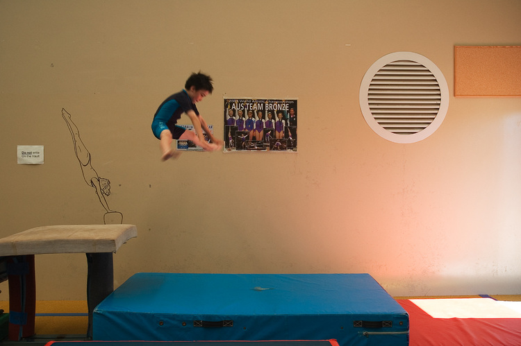
Today was Michael's gym class end-of-year exhibition session.
I'm a bit uncomfortable photographing anything sport-like (especially with 25 or 30 kids blasting around the circuit at the same time). This was one of the shots I was happier with.
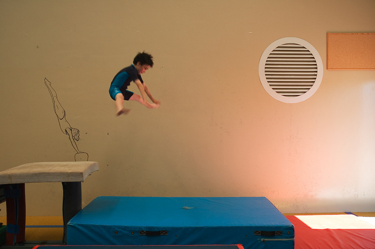
Except that I wasn't too pleased with the posters (particularly the one directly behind Michael), so I spent a while playing in Photoshop, and came up with the second one. Leaving aside that I'm pretty clumsy at doctoring photos, I'm not too sure about the end result, anyway. What do you think?
Details: Nikon 18-70mm, 25mm, f/4.5, 1/80s, ISO 200.


Comments
matt wrote, on 15 December 2005, at 11:31AM:
I would have to agree the posters are distracting but I am also not sure about the resulting image. You did a good job of removing them but the wall is a little BIG now.
matt wrote, on 15 December 2005, at 11:31AM:
sorry to post twice but I got to thinking that a vertical crop the second image would probably work really nicely!